


How to Make A State-Level Chloropleth Map in R Studio in 20 minutes!
Step-by-step Tutorial

If you want to follow along with this tutorial, the dataset that I pulled from CDC wonder can be found here. You can also open the code that I had written to watch it run yourself. That code is available in my R Markdown raw file, which I currently am unable to share on Google Drive. Drop a comment with your email if you want it, I’ll send it to you.
The best data for chloropleth maps is from CDC Wonder, at least regarding the United States. The thing is, yeah, they have their own chloropleth maps from the data but I still think it’s super cool to make maps of our own.
I know in the 21st century, especially with the advent of AI, and startups, and bragposting on Linkedin (which I unfortunately must dabble in to get the engagement that I need), there’s an aversion to reconstructing things that already exist.
But chloropleth maps are the very best of the intersection between data and art. The numbers themselves are reliable and sound, and that’s the data component. Mapping each value to a color in a map so that audiences may intuitively understand the scale of the numbers beyond just the numbers, now that is art.
Also, I think it looks dang cool in a data portfolio. You can make GIFs of maps from multiple years to show the changes in time. Finally, the number one reason that you should make a chloropleth map for your portfolio is because: it looks like it takes a lot of effort when it actually does not take much. We’re tired exhausted graduate students working full time/ internships / surviving etc. If we can find a project that gives us more pizzaz then we gotta put in it, we should definitely do that project.
Alright, here are the general instructions on how to make a chloropleth map. If you choose a different dataset or your own dataset, you may have do more data cleaning before you make the map itself.
These instructions are meant to be viewed alongside the pdf of the R Markdown file at the end of the article, also linked here.
First, load the dataset and view the dataset to make sure everything is as it should be.
`United.States.and.Puerto.Rico.Cancer.Statistics,.1999.2021.Mortality.Incidence.Rate.Ratios` <- read.delim("~/Downloads/United States and Puerto Rico Cancer Statistics, 1999-2021 Mortality Incidence Rate Ratios.txt")View(`United.States.and.Puerto.Rico.Cancer.Statistics,.1999.2021.Mortality.Incidence.Rate.Ratios`)I’m changing the dataset name, just to make it easier to interact with.
state_fgs_cancer_dataset<-`United.States.and.Puerto.Rico.Cancer.Statistics,.1999.2021.Mortality.Incidence.Rate.Ratios`I run the dataset through Janitor to clean the variable names (remove leading spaces, capitals, etc.). This isn’t technically necessary but it is a huge potential headache-saver.
library(janitor)state_fgs_cancer_dataset<-clean_names(state_fgs_cancer_dataset)Then, I just take out the excess rows where no data is stored.
state_fgs_cancer_dataset<-state_fgs_cancer_dataset%>% filter (!between(row_number(),51,111))Now I am just double checking the dataset to make sure that number columns are numeric.
str(state_fgs_cancer_dataset)I then create the joined dataset for the chloropleth map.
The "States" function in the us_map package pulls a dataset of each state, state code, state abbreviation, and data about the state's shape and how it fits into the larger map (in the geom column). So I’m just talking the data and storing it in the “states” dataframe.
library(usmap)library(dplyr)states<-us_map("states")So in the “states” dataset that’s created, the state names are all under a column called “full”. Let’s rename that column to “states”. I’ll tell you why in the next step.
states<-states %>% rename(state= full)Before I go into the syntax of the code itself, I am going to go into a basic explanation of how the left join function in R works.
Basically, it takes two separate datasets, and joins them together.
But how does it join them together?
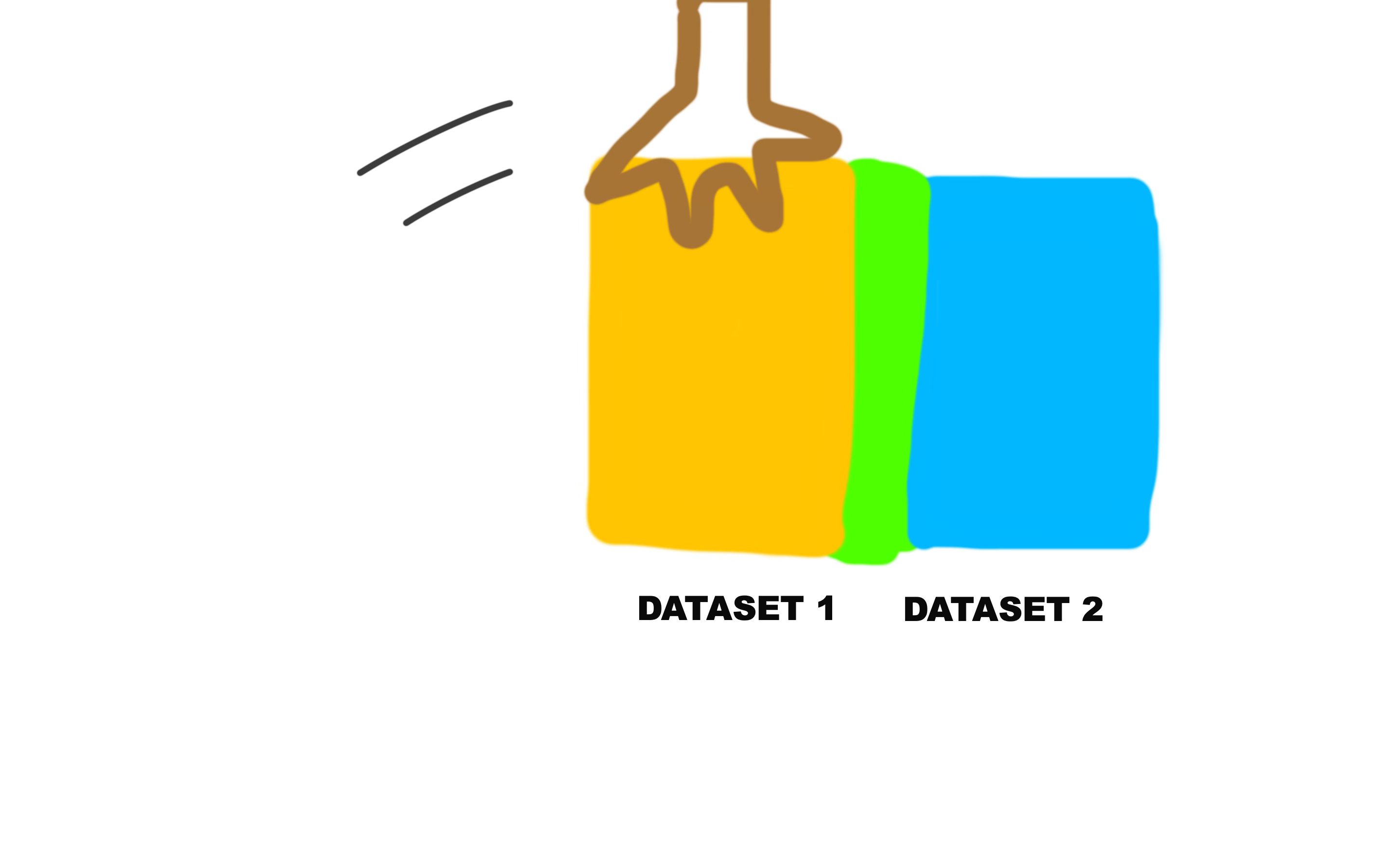
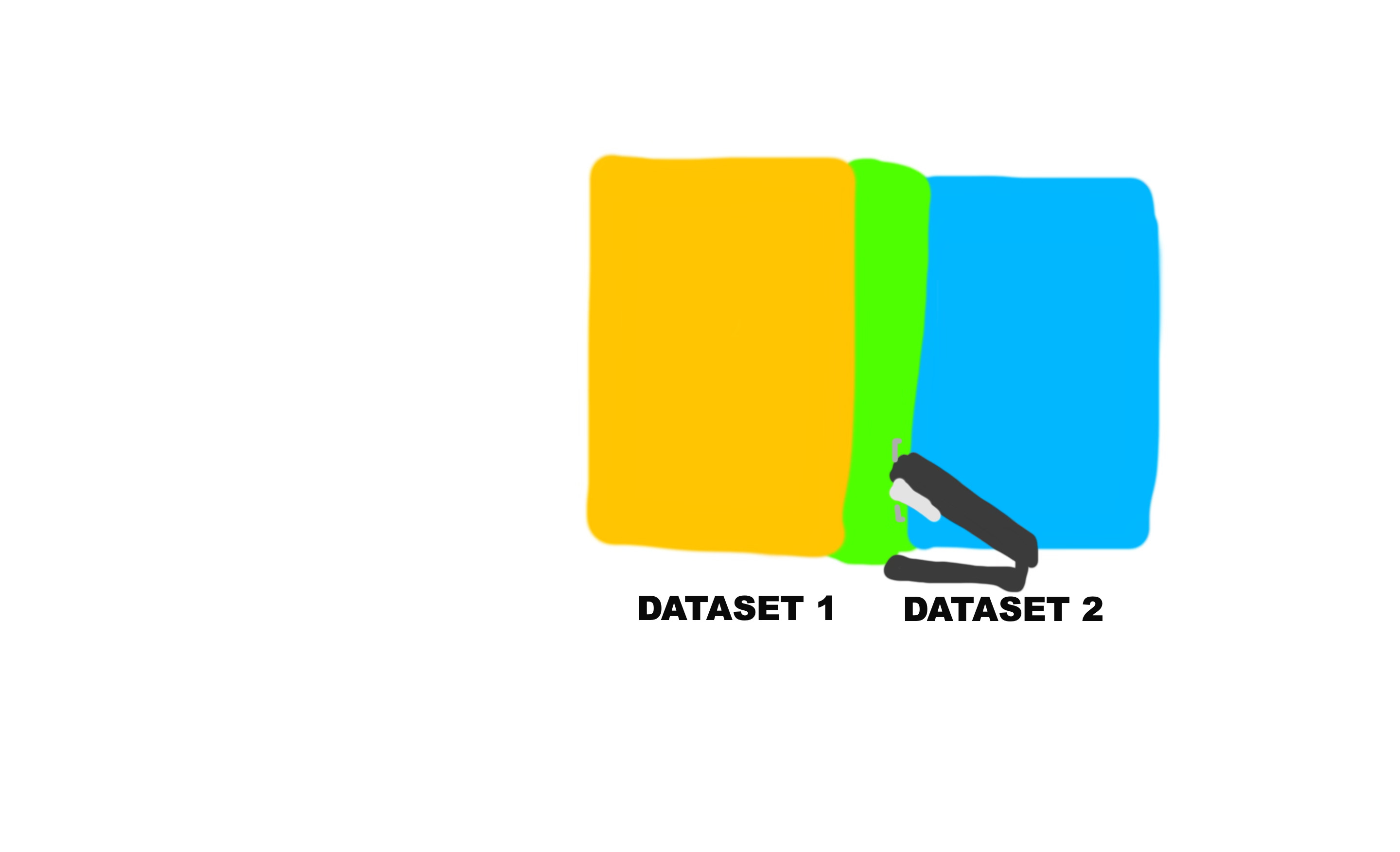
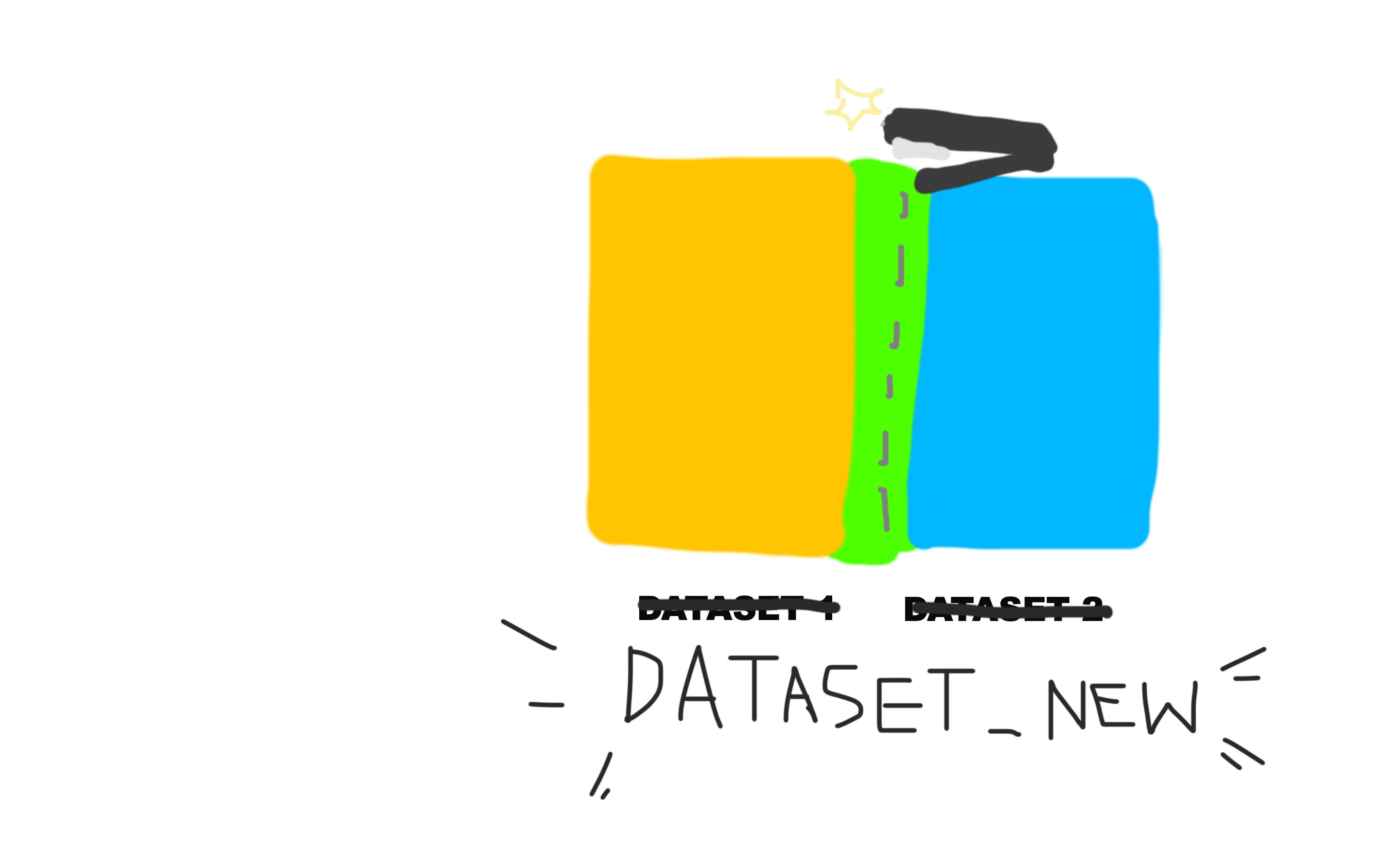
Basically, it overlaps the two datasets on a common column in order to create a new dataset.
Here’s a pictorial explanation of how it would work.
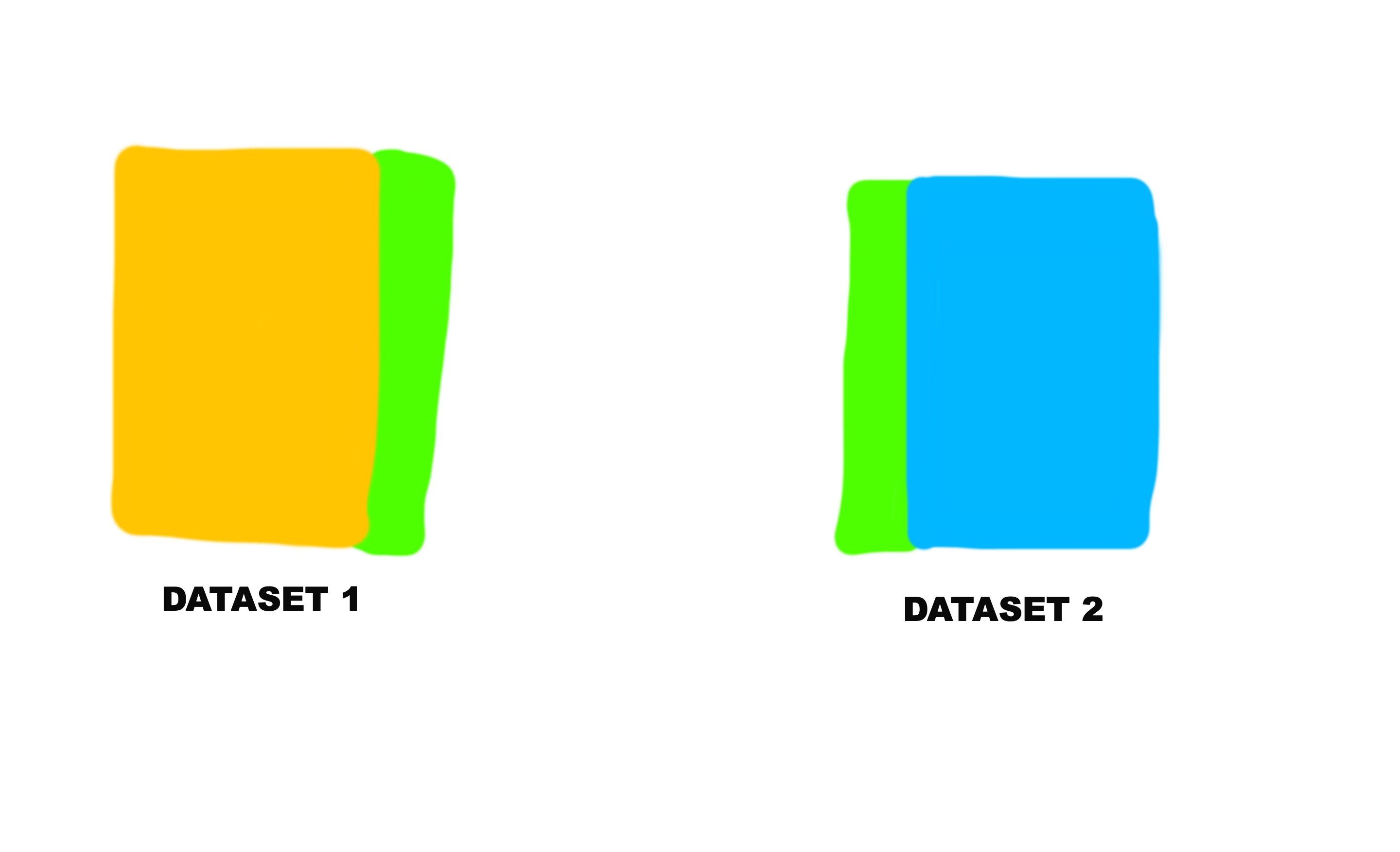
And the green sections on both the yellow and blue datasets represent the common column.
So that’s what this line of code is doing. It joins the two datasets by the state column. The state column already exists in the original dataset, the one we imported. And then in the “states” dataset we created, it was originally called full, but we renamed it to state in the previous step.
So now let’s join them together!
states_joined_dataset<-left_join(states,state_fgs_cancer_dataset, by= "state" )You can look through the new joined dataset in the visualizer to make sure nothing went wrong during the process.
Now, let’s use GGPlot to make the plot.
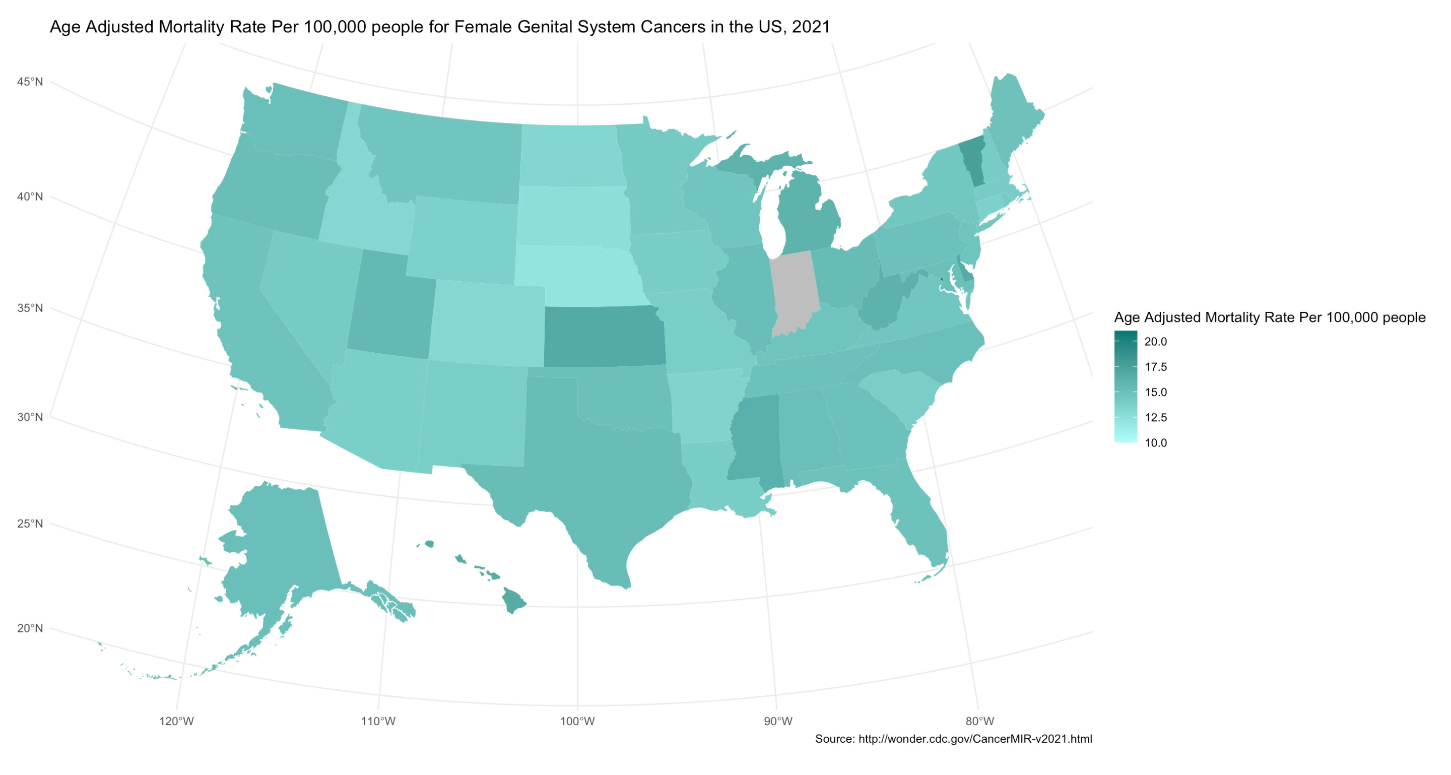
This map is a type of graph, honestly (called specifically by the geom_sf part of the phrase). But except instead of scatterplot points or bar charts, the shape isn’t just circles or rectangles, it’s the shape of each US state, and each shape has a position locking them together into the subcontinent. And each shape is filled with a color corresponding to the associated mortality rate value.
The scale fill gradient section specifies the colors for the lowest value, the highest value, and missing values. For any value in between the low and the high values, it will specifically select a color between the low and high values. Of course, if the value is relatively low, the color will be closer to the color specified for low. If the value is relatively high, the color will be closer to the color specified for high. If it’s exactly in the middle, well…take a guess, haha!
Here is the code for the plot:
library(ggplot2)
plot_fgs <- ggplot(states_joined_dataset) +
geom_sf(aes(fill = mortality_age_adjusted_rate), color = NA) +
scale_fill_gradient(
low = "#affffb",
high = "#007872",
na.value = "gray",
limits = c(10, 21) #you can change these limits based on the rates/values in the variable you were using, these were mine
) +
theme_minimal() +
labs(
fill = "Age Adjusted Mortality Rate Per 100,000 people",
title = "Age Adjusted Mortality Rate Per 100,000 people for Female Genital System Cancers in the US, 2021",
caption = "Source: http://wonder.cdc.gov/CancerMIR-v2021.html"
)
print(plot_fgs)
Your chloropleth map should generate! It should look something like this:
Thank you guys so much for reading my tutorial. If you have any questions, compliments, concerns, thoughts on regular mustard vs. honey mustard, etc. drop a comment below, and repost it on your social media (if you are feeling extremely generous) or share it with a friend who may be interested. If you aren’t, consider subscribing. It’s free, it’s going to stay free, and it’ll go quite a way in boosting my ego.
R Markdown PDF: